
Data analysis and statistics play a crucial role in understanding patterns and insights hidden within datasets. In Class 4 of InnoQuest Cohort-1, we delved deeper into the foundational concepts of statistics, exploratory data analysis (EDA), and effective data visualization techniques. Here’s a summary of the key takeaways, enriched with essential statistical concepts and answers to common questions for better understanding.
Topics Covered in Class
1. Types of Data and Visualizations
- Categorical Data: Visualized using bar charts or pie charts.
- Numerical Data: Explored with histograms, line plots, or scatter plots.
2. Exploratory Data Analysis (EDA)
- The importance of loading only relevant columns and rows from large datasets.
- Demonstrated visualization possibilities using Excel and Python’s pandas library.
3. Statistical Measures and Their Use Cases
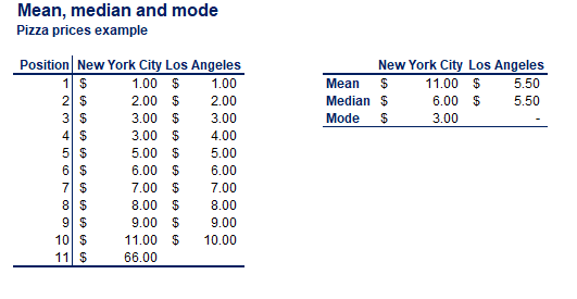
- Mean, Median, Mode: Explained with practical examples to identify outliers.
- Variance and Standard Deviation: Essential for understanding data spread.
- Skewness: Types and its importance in detecting asymmetry in data distribution.
- Covariance and Correlation: Clarified with differences and use cases (explained below).
Answering Common Questions
What is the Pareto Distribution, and Why is it Important?
The Pareto distribution is a power-law distribution used to model real-world phenomena where a small portion contributes disproportionately to the total effect (e.g., 80% of results from 20% of causes).
- Applications: Business (revenue distribution), risk management, and prioritizing critical issues in data.
- Visualization: Pareto charts are often used to highlight significant factors.
What is Covariance, Correlation, and Why Prefer Correlation?
- Covariance: Measures the direction of a relationship between two variables but depends on units, making it harder to interpret.
- Correlation: Standardizes covariance, producing a unitless measure that ranges from -1 to 1. This allows for easy interpretation and comparison.
Why Use Correlation Over Covariance?
Correlation quantifies both the strength and direction of relationships, making it more informative for data analysis and decision-making.
What are Variance and Standard Deviation?
- Variance: Measures the average squared deviation of each data point from the mean, reflecting data spread.
- Standard Deviation: The square root of the variance, offering a direct and interpretable measure of data dispersion.
Why Are These Important?
They help identify consistency, detect outliers, and assess the reliability of averages.
Insights from Class 4
Best Practices
- Use mean, median, and mode collectively for average calculations to detect outliers effectively.
- Opt for EDA techniques that suit the dataset size, focusing on loading only the required data.
- Use Python pandas for quick visualizations; for more detailed control, switch to matplotlib or seaborn.
Challenges Highlighted
- Creating plots directly using pandas lacks flexibility compared to specialized libraries like matplotlib.
- Jupyter Notebooks, while helpful, may limit code completions compared to VS Code.
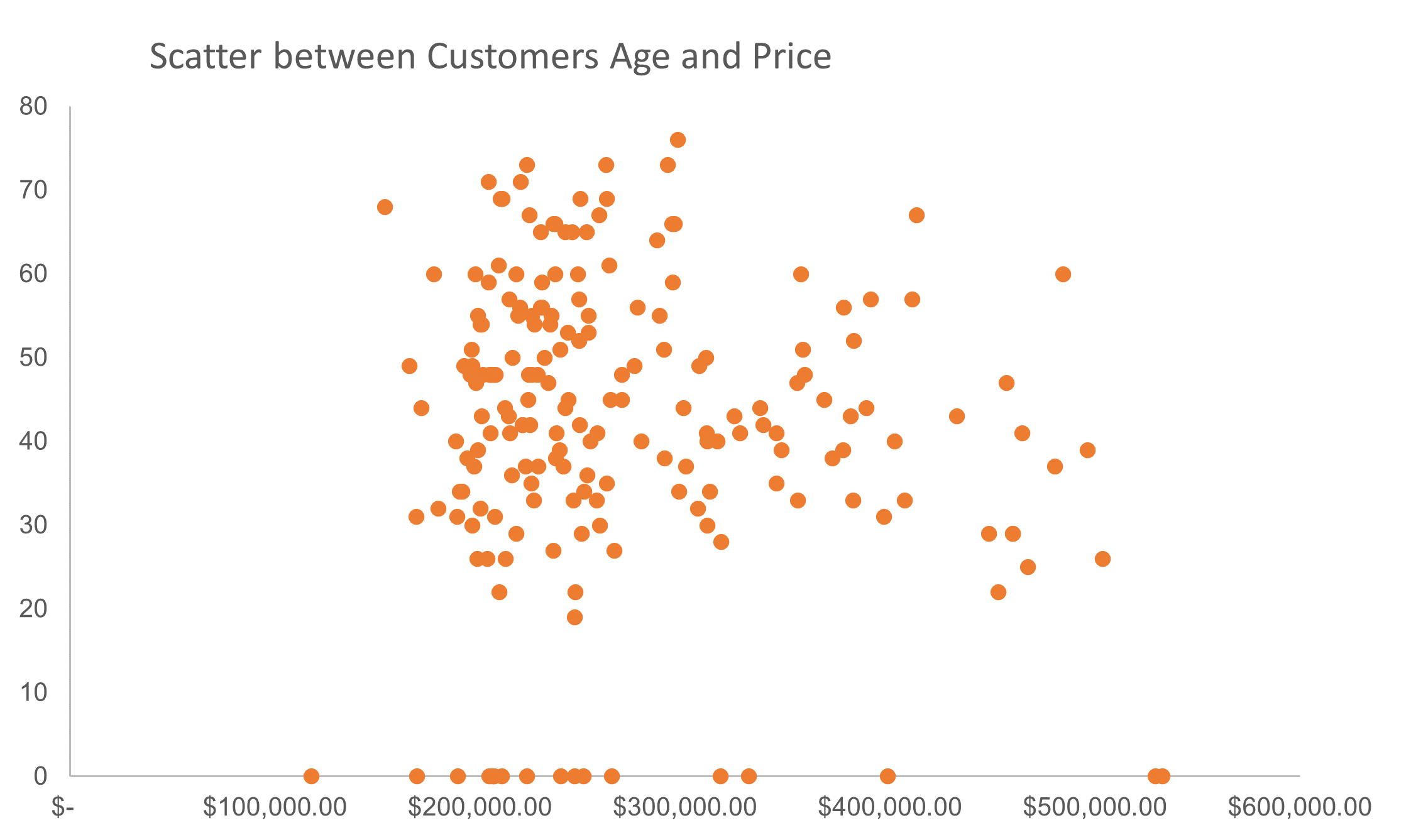
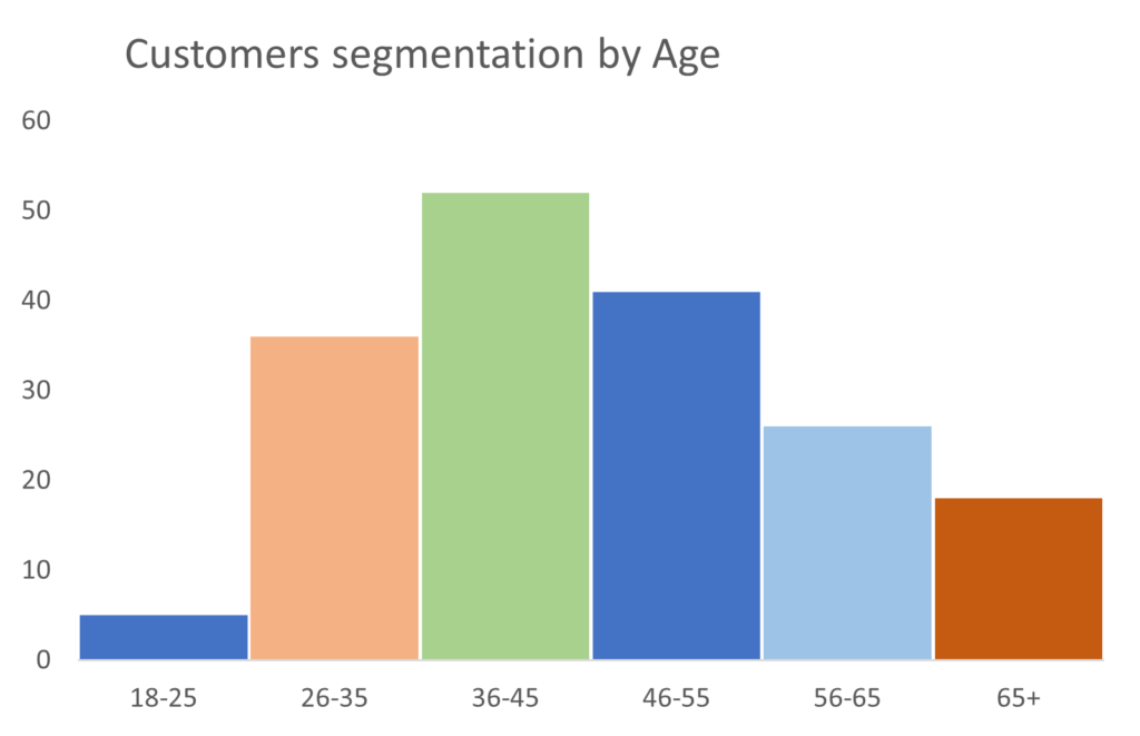
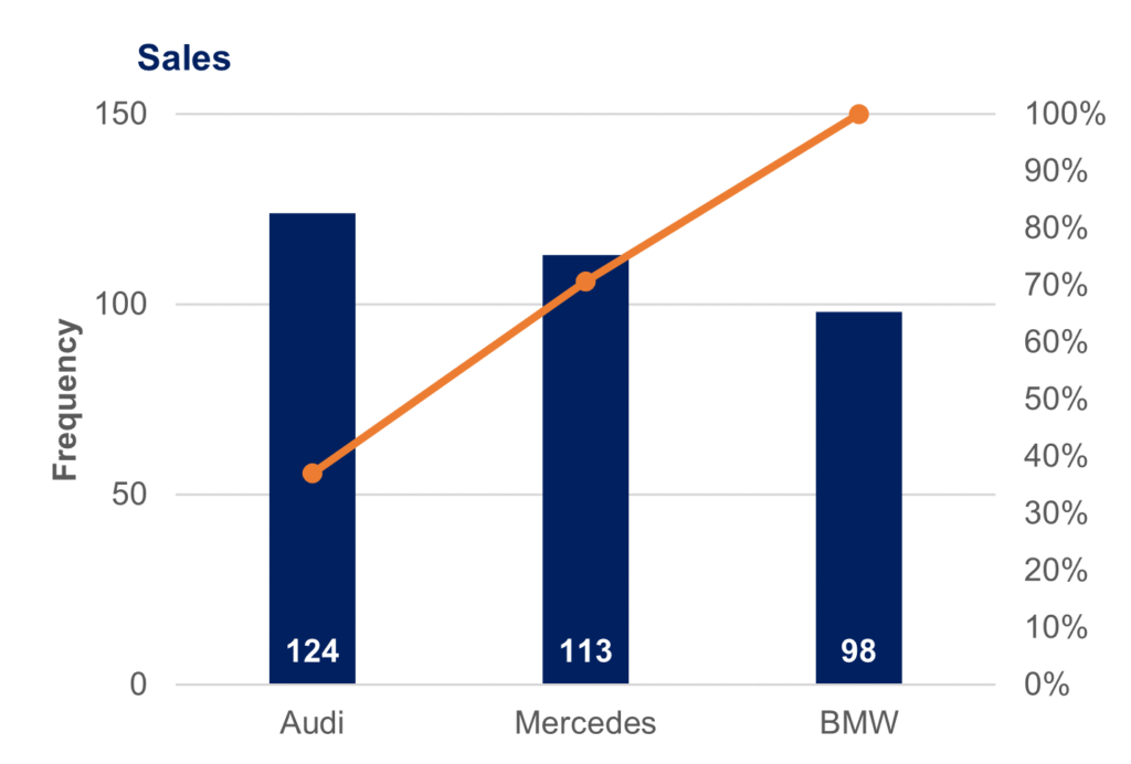
Some Visualizations from the lecture
Following are some graphs covered in the class.
Conclusion
This class served as a stepping stone to understanding how statistical measures and visualizations can lead to actionable insights. One can approach data analysis with a stronger foundation by leveraging the tools and techniques covered.
Shaukat!
You haven’t posted lec 5 yet, Waiting for it!
Thrilled to hear. It’s live now.
Great, I like it, but what about lec 5
Glad to hear this. The case studies in lecture 5 was pretty interesting.